Monday, May 29, 2006

Over the Daredevil's Ramp - Color

Arr well, didn't get to finish all of them for the class, I did finish the animatic though. Too bad it's huge or I would love to put it up. I'll come back and finish these painting later.


Saturday, May 20, 2006

Over the Daredevil's Ramp - Storyboard

Final storyboard for my storyboard class (the narrative of the story is way-way down below.) These takes forever to draw 'cuz they are all the things I'm not good at drawing. It will be hell when i get to the painting part.


Thursday, May 11, 2006

Animation Tips

Just thought I wrote a little insight list from my experience with animations. You'll be surprised how many people miss these simple rules.

Designing:

  • Start with basic shapes. Shark from Finding Nemo starts out from half a circle.
  • Play with proportions and contrast in all x,y,z axis. Ten 1:1:1 (head:body:leg) characters are boring.
  • Add details that help define, not confused.
  • Pay attention to flow and tension within your design.

Animating

  • Get your camera right before you starts animating.
  • Clear and concise anticipation, action and follow-through pose and timing. Draw them out even if you are animating in 3D. Come up with different poses and play with timing before you animate.
  • Think of the line of action and its motion. Animate character as if you are animating a stick figure. Use arc, C shape, S shape and straight line to your advantage.
  • Varies your motion speed to make it more interesting. (ex: slow slow fast slow...)
  • Heavy thing has longer slow in and slow out, and create bigger impact.
  • Elastic thing has more follow through. (Arm vs. Torso)
  • Eyes move before head, head before body.
  • Add secondary motions to make your character more alive (finger, etc.) but make sure they remain secondary.
  • Before you rig, know your character's center of balance. (Man at pelvis. Woman at hip.)
  • First and last words is the most important in Lipsync. Next priority would be words with P, M, E, and O. Get the rest as close as you can without loosing face emotion.
  • Convey story and emotion, not your animating skill.

Lighting

  • Color tint your shadow, don't use pure black.
  • Eyes have limited exposure range. Use it to create illution of light.
  • Beware of color relation. Lots of red will make all other colors look greener.
  • Think about time and temperature. (Blue tint in the morning, even light at noon, orange at evening, stronger shadow in day, warmer light in summer, etc.)
  • Add individual lighting to help boost specific object's form and matterial definition. Global lighting sux and HDRI is cheating.
  • Blue object absorbs all other colors in light except blue, leaving the bounce light blueish. More saturate and brighter color object bounces off more light.
  • Far objects tend to lose their color saturation.
  • Use mask for light in big area to create uneven lighting and the illusion of atmosphere.

Wednesday, May 10, 2006

Over the Daredevil's Ramp - Concept Story

Concept idea for my storyboard class' final project. It is going to be a picturial story (for adult) about a daredevil stunt biker and her feeling just before her death-defying stunt. It's going to be very intense and emotional; probably the hardest work for me yet. Heck, the story is about conquering your own fear and breaking the limit, so why shouldn't I do the same, right? Below's the narration of the story I'm working on and a early sketch.

"My name is Jill Ferris and I'm a daredevil stunt biker. Tomorrow I'm going to perform the longest death-defying jump in the history. Even with the best preparation we did, the chance that things doesn't go as plan is so high that no one bothers to bring it up. I must be lying if I say that I'm not afraid of dying.
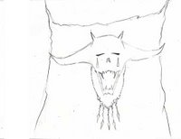
I'm terrified by my own fear.

As I change into my Daredevil suit, I can feel death's cold breath eveloping the air around me. Suddenly, I'm that helpless girl who wants to shirver forever in the dark corners. My tougue can taste the absolute emptiness in the air. It makes you want to cough something out from your throut even though you know nothing is there. I can hear death's distant laugh echoing in my brain over and over.
So why am I doing this?

Perhaps because inside of me, there is that little devil who wants to break herself free from that shrivering girl in the corner. Abraham Lincoln said "the only thing to fear is fear itself." Simple and elegant truth, but how many people are willing to face their own fear, their own excuse, their own weakness. We accomplish nothing if we fear failure. If only I can show that we can be stronger."

Friday, May 05, 2006

Low Relief Painting - Thai Chicken!

This is a little experiment I'm doing for my texture class; can you paint good lighting in b/w then apply it over the textureto fake a low relief sculpture? Well this is what I got. I must say, I really have deep respect for art in my country. Can't imagine how they came up with this for a chicken. Let's just say that they were lucky I wasn't the one designing these things for them. :3

Tuesday, May 02, 2006

Random Street Sketches


I was walking back from art store and I passed this suppostedly 'huanted house'. It really gave me goosebump and so I really wanted to sketch it. However, being a chicken that I am, I sketched the church close to it instead.

:p

Too bad it rained before I could finish this... Just wanna say I really like the architecture in Savannah. They are kinda cool in a wierd old way.


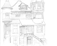
Another random sketch. I always have an eye on this house because it looks like a castle. I didn't get to finish it though 'cuz I had to go to class.
Anyway, while I was drawing this, a boy who lived there came up and talked to me about the house. Basically, bunch of poor families live together in this house like a community. Hey kid, you might not have much money, but you have a nice big family and you got to live in a castle! Many rich kids will be jealous of ya. :)